
As Media Evaluation.
1. In what ways does your media product use, develop or challenge forms and conventions of real media products?
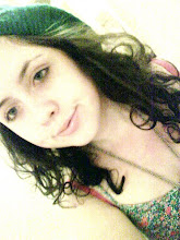
We put our title frame at the end of our title sequence. We added it at the end so that when the film is about to play, the title will appear just before it. Our picture was of our main character Carrie and a rose next to her. The title is written in red because it goes well with our thriller theme and could also signify blood and romance which are both main apects of our film. We used the font, Santo Dument. This font has a shadow to the back of it, so it gives the title a creepy edge.
Other forms and conventions I have seen in other thriller title sequences are the title frame coming before the action and also the font being black and white. In the title sequence Hard Candy, the film we took inspiration from is a good example of this.
We challenged the forms and conventions of a normal thriller title opening by putting action in it, with the main character of the film. This is different from normal thriller which usually has a very simple animated title opening to conceal the action.
1. In what ways does your media product use, develop or challenge forms and conventions of real media products?
We put our title frame at the end of our title sequence. We added it at the end so that when the film is about to play, the title will appear just before it. Our picture was of our main character Carrie and a rose next to her. The title is written in red because it goes well with our thriller theme and could also signify blood and romance which are both main apects of our film. We used the font, Santo Dument. This font has a shadow to the back of it, so it gives the title a creepy edge.
Other forms and conventions I have seen in other thriller title sequences are the title frame coming before the action and also the font being black and white. In the title sequence Hard Candy, the film we took inspiration from is a good example of this.
We challenged the forms and conventions of a normal thriller title opening by putting action in it, with the main character of the film. This is different from normal thriller which usually has a very simple animated title opening to conceal the action.
No comments:
Post a Comment